The Same Data, Four Different Stories
The consumer looks fine—depending on which consumer, which denominator, and where we place the axis.
A social-media chart recently declared that the consumer “looks just fine.” The evidence was a rising estimate of discretionary spending as a share of retail sales. The chart was real. The conclusion was plausible. But neither tells us which households are carrying the expansion—or how much of the apparent relationship is simply the product of two trending series.
We begin with one official wealth dataset, change only its presentation, and watch four narratives emerge. Then we connect wealth concentration to income inequality and a transparent retail proxy. Finally, we test whether the apparent relationship survives basic econometric scrutiny.
Run the complete RainbowStats analysis
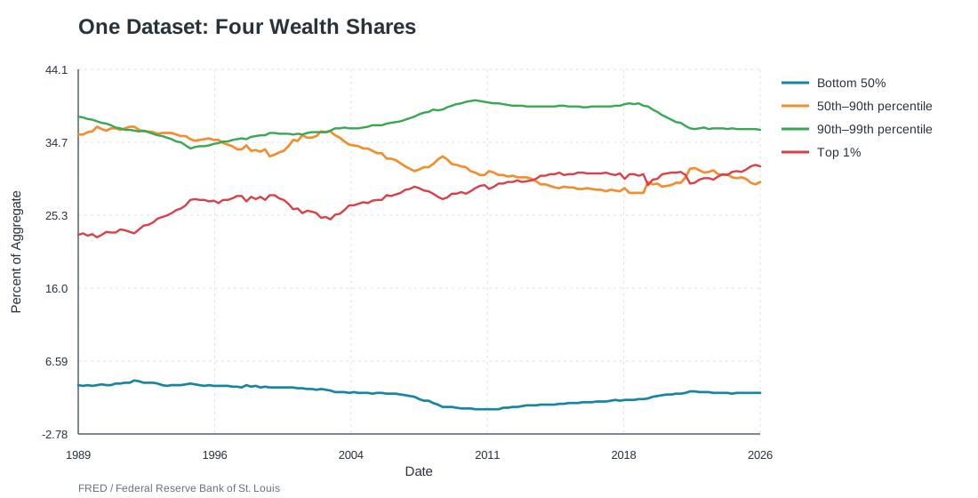
One dataset, first impression
The Federal Reserve divides household net worth into the bottom 50%, the 50th–90th percentiles, the 90th–99th percentiles, and the top 1%. These are wealth tiers, not equal quintiles.
A tighter scale reveals redistribution
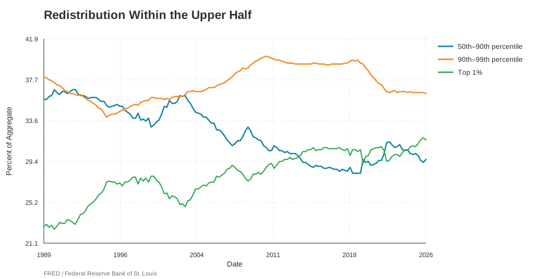
The top 1% rose from roughly 23% to nearly 32% of net worth. The 50th–90th percentile group fell from about 36% to 30%, while the next 9% was comparatively stable. The dominant long-run transfer was from the broad upper-middle toward the top 1%.
The bottom 50% tells another true story
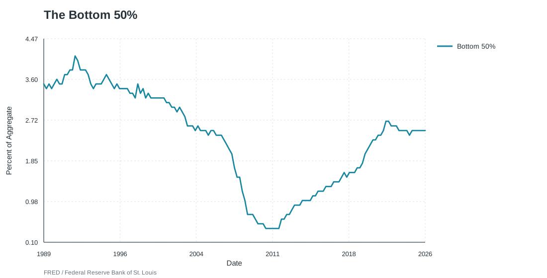
The share fell from about 3.5% to roughly 0.4%, then recovered to around 2.5%. That recovery matters greatly to the households involved. But a large percentage change in a small share is not the same as a large change in the national distribution.
Change the denominator, change the message
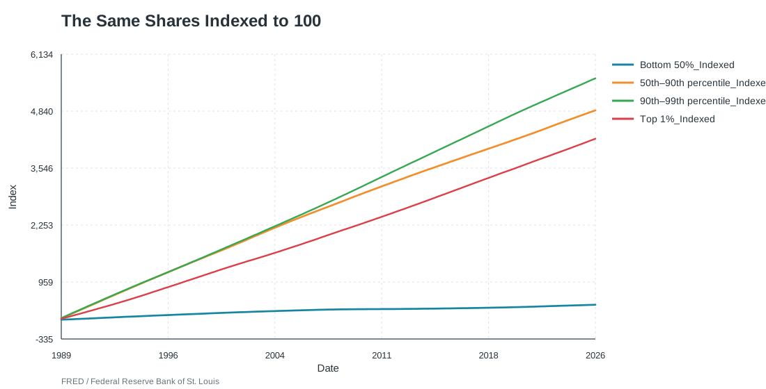
Shares answer “Who owns the wealth?” Indexed lines answer “How has each group’s share changed relative to its base?” Both are correct. Neither alone describes household welfare.
Wealth concentration and the Gini
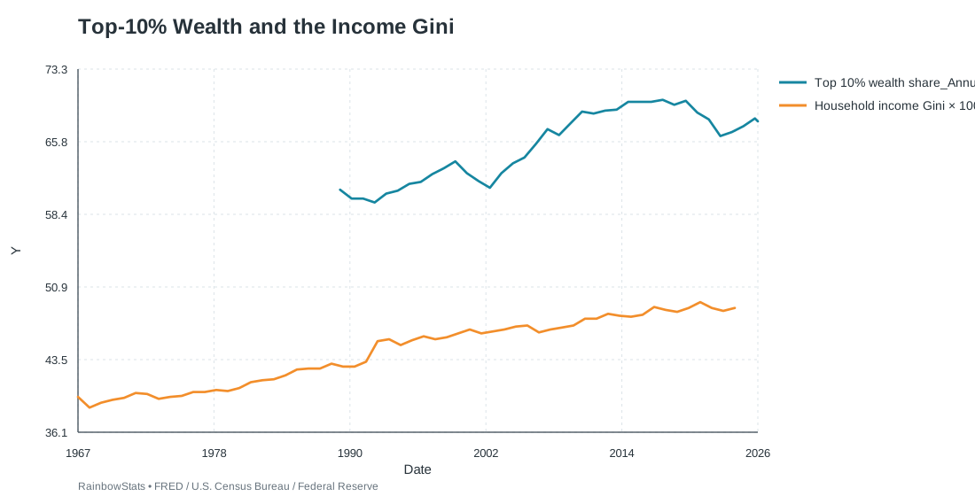
The two measures are related but not interchangeable. Income inequality shapes saving capacity. Accumulated wealth creates capital income and collateral. Asset appreciation then reinforces spending power among households that already own stocks, real estate, and businesses.
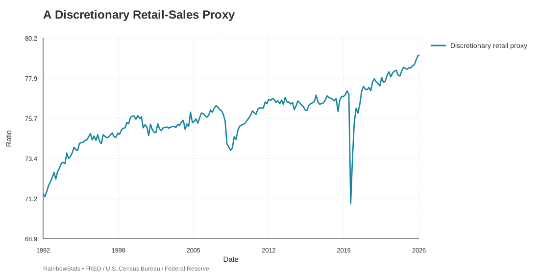
A transparent discretionary-retail proxy
To reproduce the spirit of the original post, we calculate:
100 × (total retail and food services − groceries − health and personal care − building and garden stores) ÷ total
Are affluent households driving the engine?
A widely cited Moody’s estimate places the top 10% of earners near half of consumer spending. That is plausible given the concentration of appreciating assets, but it is a modeled estimate—not a directly published Census distribution series.
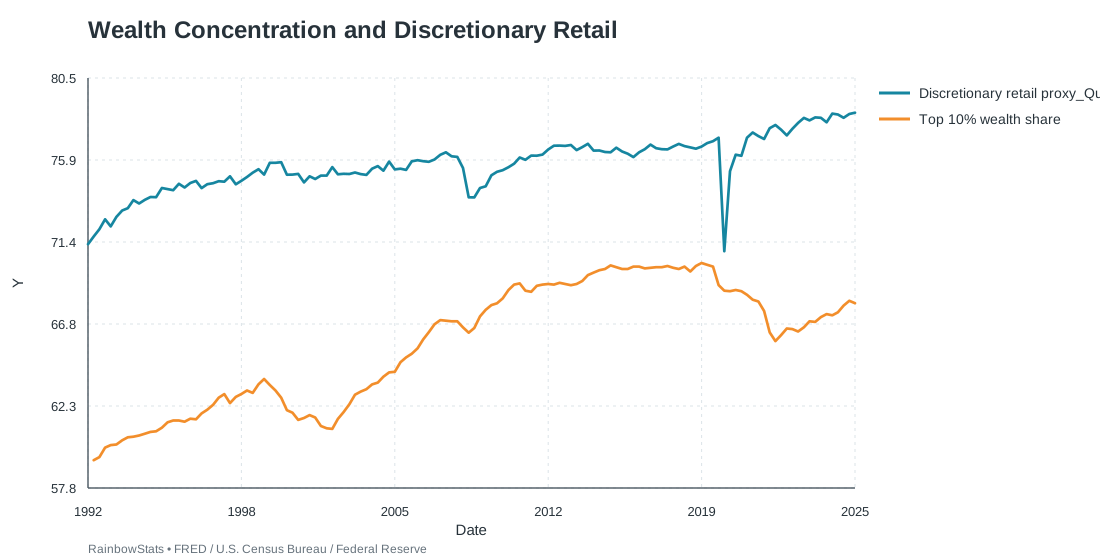
The hypothesis makes economic sense: affluent households can transmit asset gains into discretionary demand. Aggregate retail data may remain strong even while lower- and middle-income households are strained. But a plausible mechanism is not the same as statistical proof.
The regression that looks too good
| Specification | R² | Wealth slope | Wealth t | DW |
|---|---|---|---|---|
| Levels | 0.449 | 0.287 | 10.403 | 0.464 |
| First differences | 0.0045 | 0.171 | 0.768 | 2.735 |
| Differences + COVID | 0.285 | 0.214 | 1.127 | 2.110 |
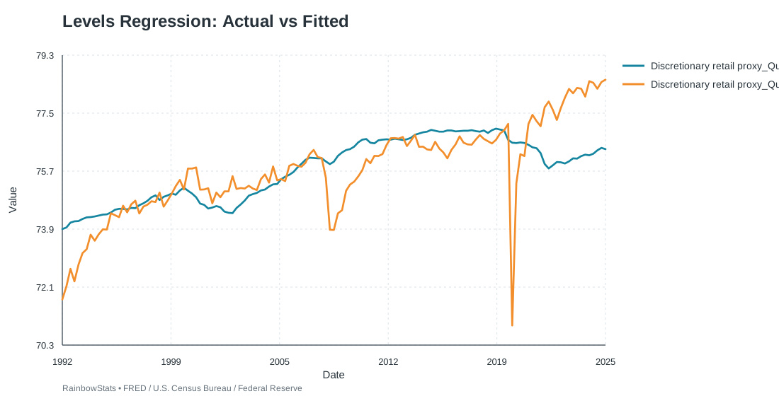
The levels regression produces a positive slope and R² of 0.449. The warning is a Durbin–Watson statistic of only 0.464. The residuals are strongly autocorrelated—the classic setting in which two trends can manufacture an impressive relationship.
The story disappears in changes
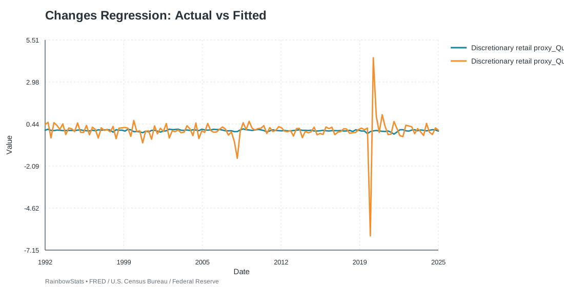
Quarterly changes in the top-10% wealth share do not explain quarterly changes in the retail proxy. This does not disprove a long-run wealth effect. It does show that the simple levels regression overstated the evidence.
COVID improves the model—not the wealth result
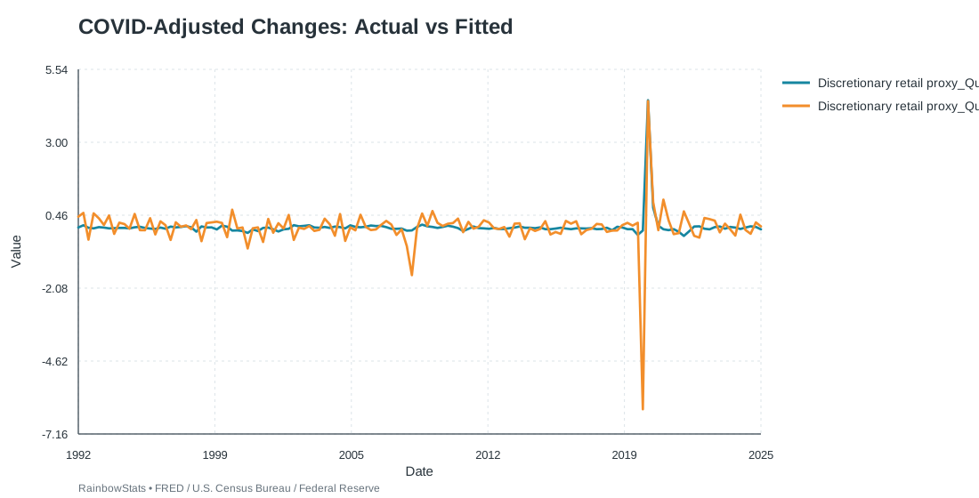
Adding the COVID intervention raises R² to 0.285 and improves the residual behavior. But the explanatory power comes from COVID: its t-statistic is 7.164. The top-10% wealth-change coefficient remains insignificant with a t-statistic of 1.127.
So, does the consumer look fine?
In aggregate, perhaps. Discretionary retail categories hold a historically high share, and asset-owning households possess the balance sheets to keep spending. But “the consumer” is not one representative household.
The economy may be resilient not because every consumer is fine, but because the consumers with the most spending power are doing very well.
That concentration is both resilience and fragility. It supports demand today while making future spending more sensitive to stock prices, real estate, and high-income employment.
Data do not eliminate stories
Data arrive with choices: scale, denominator, grouping, transformation, proxy, time period, and model. The answer is not to avoid stories. It is to expose the construction, show alternative views, and test whether the conclusion survives another specification.
Reproduce every chart and regression
- Federal Reserve Distributional Financial Accounts
- U.S. Census household income Gini via FRED
- U.S. Census retail trade and food services via FRED
- Reuters reporting on the divided consumer economy
- Analysis and SVG charts produced with RainbowStats™. Educational use only.