How state boundaries appear to shape local housing dynamics—even after county income, listings and real economic growth are taken into account.
An exploratory analysis of 213 counties in eight states · Observation year: 2024
State membership alone explains 44.5% of the variation in county house-price growth. After state differences are removed, the three local economic variables explain only 1.2%.
A state line is an artificial mark on a map. It does not stop workers from commuting, families from moving or businesses from selling across the border. Yet housing markets appear to treat those lines as real.
We assembled county observations from Washington, Oregon, Idaho, Texas, New York, Illinois, Maryland and West Virginia. For every county with complete data, we compared annual growth in the FHFA All-Transactions House Price Index with growth in per capita personal income, total listings and real GDP. FIPS codes kept the county observations aligned. Texas, with 59 complete counties, became the reference state.
The result is not subtle. The counties separate primarily by state—not by the three measured county fundamentals.
The state averages separate
The clearest place to begin is the state summary. Texas, Oregon and Washington recorded the lowest average county house-price growth in this sample. Illinois, New York and West Virginia recorded the highest. Those differences do not line up neatly with income growth, listing growth or real GDP growth.
State
Counties
House prices
Income
Listings
Real GDP
TX
59
2.5%
3.6%
16.0%
3.8%
OR
18
3.0%
5.2%
17.1%
2.6%
WA
22
3.6%
4.7%
15.8%
3.4%
ID
6
4.2%
5.5%
10.0%
4.4%
MD
18
5.7%
5.2%
11.0%
3.1%
WV
12
6.1%
4.3%
6.6%
3.7%
NY
47
6.4%
4.5%
30.1%
2.5%
IL
31
6.8%
3.6%
6.3%
1.8%
Table 1. Mean annual log changes for complete county observations. Figures are rounded.
Texas, Oregon and Washington occupy the lower-growth part of this sample. Illinois, New York and West Virginia generally sit higher. Maryland and West Virginia were included deliberately: neighboring states with very different political and economic identities help prevent an easy “red versus blue” or “coast versus interior” explanation.
Local fundamentals do little within states
Model
R²
Adjusted R²
What it captures
Pooled OLS
0.038
0.024
Income, listings and real GDP
State indicators only
0.445
0.426
Differences among state means
State fixed effects
0.451
0.424
Common slopes plus state intercepts
Within-state regression
0.012
−0.003
Variation after state means are removed
State interactions
0.525
0.444
Different intercepts and slopes
The state fixed-effects test is decisive: F = 21.740 with p < 0.001. The joint slope-interaction test is not: F = 1.337 with p = 0.157. The important difference is therefore primarily a shift in state intercepts, not persuasive evidence that income, listings and GDP have entirely different slopes in every state.
Within the fixed-effects model, per capita income growth has a coefficient of 0.236 (t = 1.299), listing growth is effectively zero (t = −0.038), and real GDP growth has a coefficient of 0.019 (t = 0.302). None explains much of the remaining county variation.
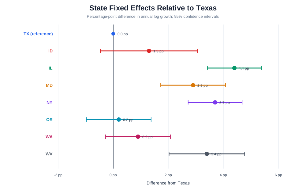
Figure 1. Estimated state intercept differences relative to Texas after controlling for county income, listings and real GDP growth. Texas is the largest group and therefore the reference state.
Relative to Texas, the estimated 2024 state effects are approximately 4.4 percentage points for Illinois, 3.7 for New York, 3.4 for West Virginia and 2.9 for Maryland. Oregon's estimated difference is close to zero; Washington and Idaho lie between the extremes.
What remains after accounting for the state?
The sorted residual chart answers a different question. After the model assigns each state its own intercept, which counties still performed materially above or below their state-conditioned predictions?
Figure 2. Sorted fixed-effects residuals, colored by state. State adjustment removes the broad group bands but leaves important local exceptions. Large residuals identify counties for follow-up, not automatic evidence of bad data.
The state summary and coefficient estimates show the clustering; the residual chart shows what the state labels do not explain. That distinction matters. A state boundary appears economically meaningful, but it does not eliminate county-specific housing dynamics.
Why might an artificial boundary become economically real?
A border does not directly change the value of a house. Institutions attached to that border might. States differ in property-tax systems, insurance markets, foreclosure procedures, infrastructure finance and the legal authority delegated to local zoning and permitting. They also entered 2024 after different pandemic-era price cycles, migration patterns and construction responses.
The state coefficient is not a policy coefficient. It is a container for everything shared within a state that the regression has not measured. The result tells us where the unexplained separation occurs; it does not yet tell us which law, institution or historical condition produced it.
The listing result deserves special caution. The series measures active plus pending listings and is not seasonally adjusted before annual conversion. More listings can represent added supply, but listings may also increase because a strong market induces owners to sell. New York combined the largest mean listing increase in the sample—30.1%—with 6.4% house-price growth. Contemporaneous listing growth is therefore not a clean supply shock.
This is not a fifty-state conclusion
Eight selected states are not the United States. This exploratory sample contains 213 complete counties from WA, OR, ID, TX, NY, IL, MD and WV. It does not include all fifty states, and the number of usable counties differs substantially across states. The findings should not be generalized nationally without a larger study.
The next step is to repeat the analysis across all available states and multiple years. A stronger design would compare neighboring counties on opposite sides of state borders, add lagged house-price appreciation, construction permits, housing stock, population or migration, insurance costs and effective property-tax burdens, and test whether the apparent discontinuities persist. A border-county or spatial discontinuity design would move the research closer to causal interpretation.
Conclusion
Our measured county fundamentals barely explain house-price growth within states, while state membership explains nearly half of the total cross-sectional variation. That is too large to dismiss, but too incomplete to declare victory.
State boundaries may be artificial marks on a map. Once governments attach different rules, taxes, risks and development constraints to them—and once housing cycles develop different histories on either side—markets can begin to treat those lines as real.
FHFA House Price Index. FHFA describes its HPI as a weighted repeat-sales measure of single-family house-price movements available at several geographic levels, including counties.
BEA GDP by County. Real GDP measures the value of goods and services produced within a county.
All calculations were performed in RainbowStats. Growth rates are log differences. County series were joined by five-digit FIPS code, and the cross-section was evaluated at 2024-01-01. Results may change as source data are revised.