Viva La Différence
A simple chart went viral. The argument it started was anything but simple.
Run the analysis in RainbowStatsA simple chart that went viral had me thinking. It claimed that men had gained no jobs since Trump took office. With more than 400,000 views—and a comment section increasingly divided between partisan and sometimes openly sexist explanations—the chart deserved a closer look. Was this really evidence of men losing ground to women, or was something more complicated happening beneath the aggregate numbers?
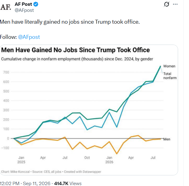
The chart can be right while the comments are wrong
An aggregate employment chart is an accounting statement. It can show that recent net job growth accrued to women while men's employment was approximately unchanged. It cannot tell us why. It says nothing by itself about ability, effort, discrimination, the quality of new jobs, or the occupations in which the changes occurred.
That distinction was largely lost in the online reaction. A chart about employment totals quickly became an argument about the supposed characteristics of men and women. Before drawing cultural conclusions, we should ask a more basic statistical question: how are men and women distributed across occupations, and what do those occupations pay?
Our occupational analysis asks where men and women work and how the distributions of occupational median earnings differ. These questions are related, but they are not the same question.
Building a comparable occupational sample
RainbowStats loaded the Bureau of Labor Statistics Current Population Survey occupational earnings files for 2025. We required complete observations for men's and women's median usual weekly earnings and employment. To reduce the instability of small samples, both sexes had to have at least 100,000 workers in an occupation. Aggregate occupational groups were removed so that their detailed components would not be counted twice.
The result was a common sample of 66 detailed occupations. Each point below represents one occupation—not one person.
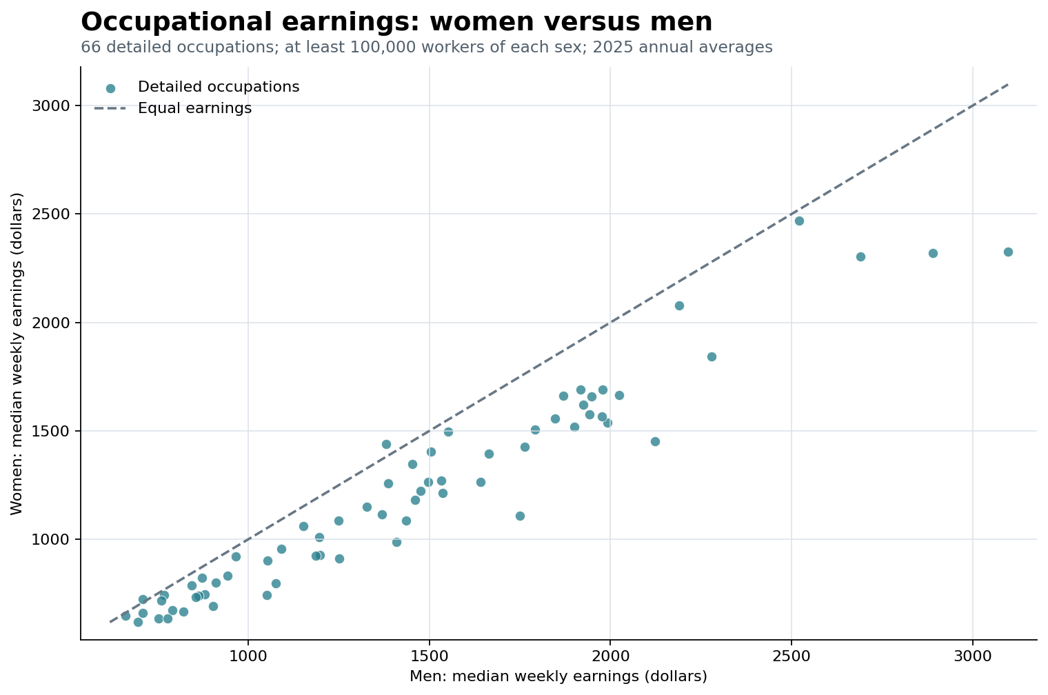
The relationship is unmistakable: occupations paying more to men generally also pay more to women. Yet most observations fall below the equal-earnings line. Two categories in this filtered sample were modestly above it: purchasing agents and hand packers and packagers. Several others—notably pharmacists and food preparation workers—were close to parity.
| Occupation | Men | Women | Women / men |
|---|---|---|---|
| Purchasing agents, except wholesale, retail, and farm products | $1,380 | $1,440 | 104.3% |
| Packers and packagers, hand | $707 | $724 | 102.4% |
| Pharmacists | $2,520 | $2,471 | 98.1% |
| Food preparation workers | $660 | $647 | 98.0% |
| Personal care aides | $767 | $743 | 96.9% |
First view: every occupation gets one vote
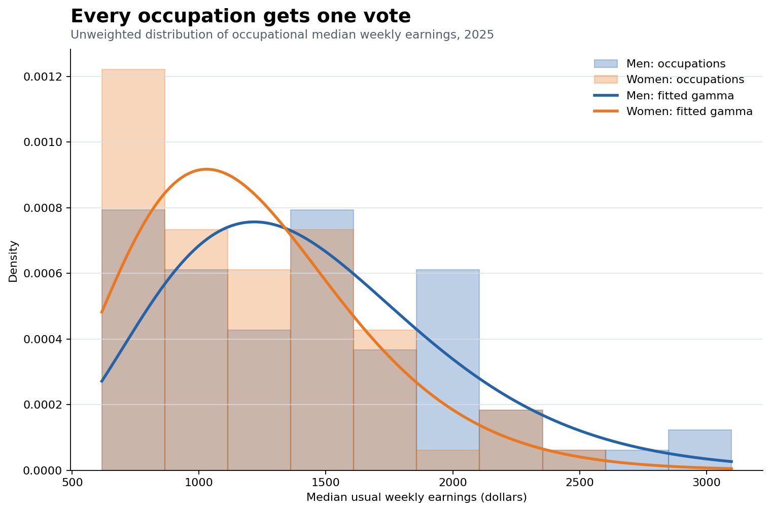
We first treated each of the 66 occupations equally. A large occupation and a small occupation each contributed one observation. This answers a category-level question: what does the distribution of occupational median earnings look like?
| Unweighted statistic | Men | Women | Women / men |
|---|---|---|---|
| Median occupation | $1,397 | $1,131 | 81.0% |
| Fitted Gamma shape | 6.498 | 6.771 | — |
| Fitted Gamma scale | 221.467 | 178.468 | — |
| Mean implied by fit | $1,439 | $1,208 | 84.0% |
The fitted curves should not be mistaken for individual wage distributions. They summarize a distribution of 66 occupational medians. Still, they make the central pattern clear: the two distributions overlap considerably, but the women's curve is shifted toward lower-paying occupational medians.
Second view: weight occupations by employment
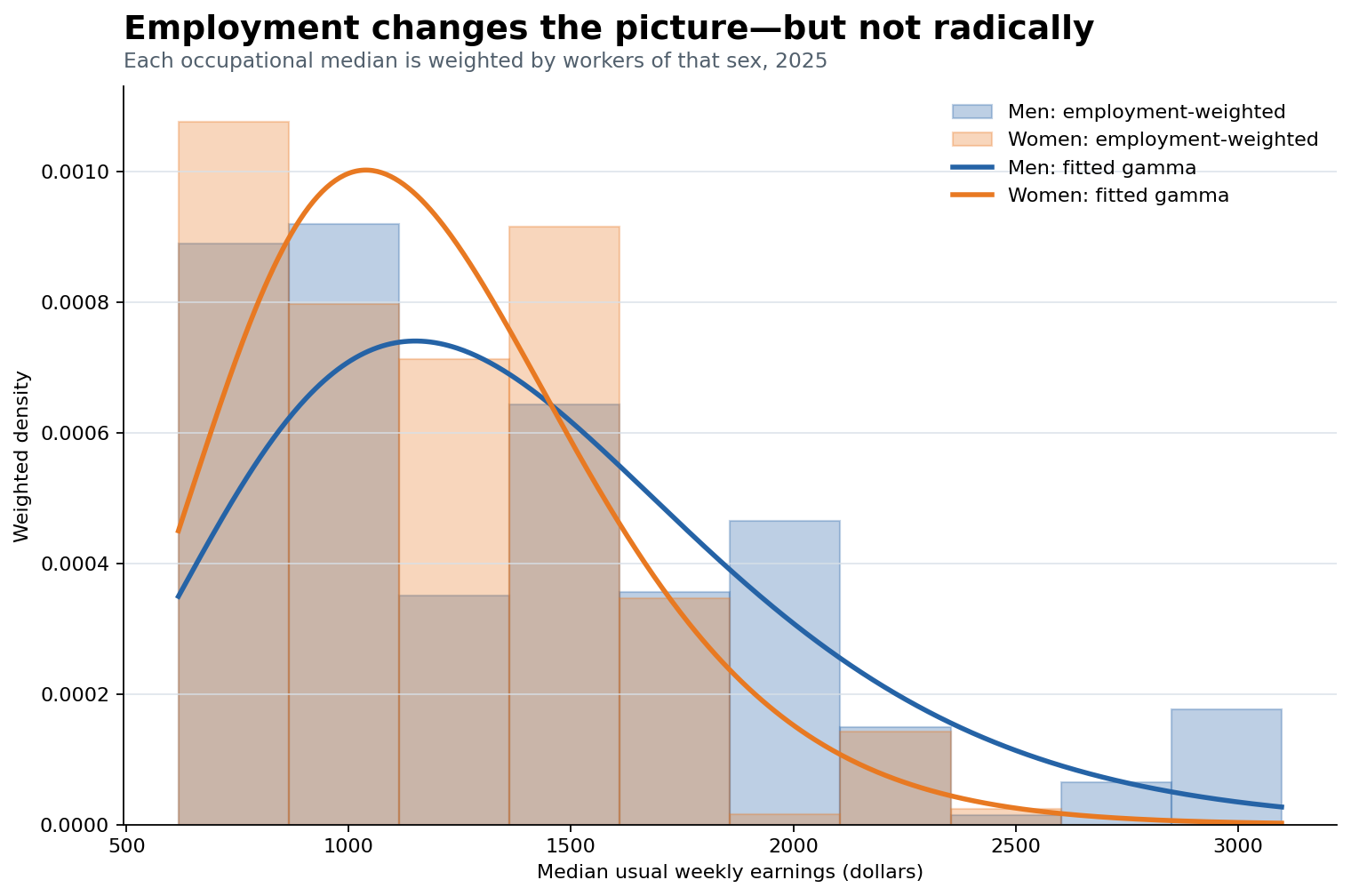
The unweighted chart treats every occupational category equally even though employment varies enormously. We therefore repeated the exercise using the number of men and women employed in each occupation as frequency weights. Men's occupational medians were weighted by men's employment; women's medians were weighted by women's employment.
This is not a distribution of wage multiplied by employment. The wage remains the occupational median. Employment determines how much influence that median receives in the fitted distribution.
| Central measure | Men | Women | Women / men |
|---|---|---|---|
| Unweighted median occupation | $1,397.0 | $1,131.0 | 81.0% |
| Employment-weighted mean | $1,393.5 | $1,187.6 | 85.2% |
| Change after weighting | −$3.5 | +$56.6 | +4.3 percentage points |
The surprising result: the centers are fairly close
Weighting changes the composition of the distributions, but it does not radically change their centers. For men, the unweighted median occupation was $1,397 per week and the employment-weighted mean was $1,393.5—a difference of only $3.50. For women, weighting raised the center from $1,131 to $1,187.6, a larger but still measured shift of about $57.
The women-to-men ratio therefore rose from 81.0% using the median occupation to 85.2% in the employment-weighted calculation. Occupational composition matters, particularly for women, but the broad distributions are not two different worlds. They overlap substantially.
That is precisely why the viral debate was too simple. Women can account for recent net employment growth while still being concentrated differently across occupations and while occupational median earnings remain lower in much of the common sample. Employment growth and occupational earnings are separate dimensions of the labor market.
One line to reproduce the study
The entire analysis—data retrieval, occupation classification, sample filtering, table construction, scatterplot, fitted distributions, employment weighting, merged charts, and slideshow—is available through one RainbowStats command:
Gender=BLS_GENDER(2025,100)
SLIDESHOW(Gender)
The simplicity of the command should not be confused with simplicity of the research. The data engineering, statistical choices, and interpretive cautions are embedded in the operator. The benefit is reproducibility: readers can rerun the analysis, change the employment threshold, select particular occupations, or inspect the underlying series.
Data and replication notes
- Data: BLS Current Population Survey labor-force statistics, 2025 annual averages.
- Population represented by the earnings series: full-time wage and salary workers.
- Sample: 66 detailed occupations with complete earnings and employment observations and at least 100,000 workers of each sex.
- Aggregate occupation rows were removed to avoid double counting.
- Unweighted results give each occupation equal influence.
- Weighted results use sex-specific occupational employment as frequency weights.
- Gamma fits use moment estimates and summarize occupational medians, not microdata.
- Static figures and the CSV snapshot are included in this publication package.
Viva la différence—carefully understood
The phrase is not a celebration of unequal outcomes. It is a reminder that differences must be measured before they are explained. The viral chart told us something interesting about recent employment. It did not tell us why it happened, and it certainly did not justify a sexist conclusion.
Once we look inside the aggregate, the labor market becomes more complicated and more informative. Men and women work in different occupational mixtures. Their occupational earnings distributions overlap, but they are not identical. Employment weighting narrows the difference, though it does not erase it. That is a conclusion worth discussing—and one that can be tested rather than shouted across a comment section.