Fifty States, Three Economic Stories
Unemployment, labor participation, and state GDP through the lens of principal components—and the power of RainbowStats wildcards.
A national economic number is useful. But it cannot tell us whether fifty states are moving together, whether a few are following a different cycle, or whether the answer changes when we look at a different measure of economic activity.
This morning I asked three questions. How much do state unemployment rates move together? Is the same true of labor force participation? And what common patterns appear in the growth of state output?
RainbowStats makes those questions unusually easy to explore. Three wildcard expressions assemble three collections of state data. The same principal-component command then examines each collection. The result is not one answer repeated three times. It is three different economic stories.
The wildcard does the collecting
The two dollar signs, $$, are a placeholder. RainbowStats substitutes the appropriate state identifier and collects the resulting series into a list.
| Question | RainbowStats expression | Example of the substitution |
|---|---|---|
| State unemployment | loop_State2($$UR) |
WYUR, CAUR, WAUR |
| State labor force participation | loop_State_ANSICODE(LBSSA$$) |
LBSSA56, LBSSA06, LBSSA53 |
| Quarterly real state GDP | loop_State2($$RQGSP) |
WYRQGSP, CARQGSP, WARQGSP |
Each loop returned 51 series: all fifty states and Washington, D.C. The participation loop uses numeric state identifiers; the other two use two-letter abbreviations. Different naming conventions, the same analytical workflow.
Once the list exists, a single expression performs the transformation, analysis, and presentation:
slideshow(pc_analysis(logdiff(lUNRate)))
Replace lUNRate with LaborPart or lGDP, and the identical workflow answers a different economic question. We do not have to hand-assemble fifty-one separate charts or redesign the analysis for each dataset.
What a principal component tells us
Principal component analysis, or PCA, finds weighted combinations of series that summarize their shared variation. The first component captures the largest amount. The second captures the largest remaining amount, subject to being uncorrelated with the first in the sample.
RainbowStats labels the first component PC_0, the second PC_1, and so on. Those are statistical labels, not economic explanations. A component earns an economic interpretation only after we inspect the states associated with it and consider outside evidence.
Here, LOGDIFF examines changes in the logarithm of each series. For unemployment and participation, these are proportional changes in rates, not percentage-point changes. For real GDP, they are log growth. PCA standardizes each input series and uses its correlation matrix, so a state's role is not determined simply by its population, GDP level, or raw volatility.
| Separate analysis | Observations per series | First component | First five together | Components reaching 95% |
|---|---|---|---|---|
| Unemployment | 605 monthly changes | 84.02% | 91.03% | 13 |
| Labor force participation | 605 monthly changes | 41.85% | 62.66% | 33 |
| Real state GDP | 84 quarterly changes | 66.25% | 79.90% | 21 |
These are descriptions of three separate samples. GDP uses fewer observations at a different frequency; the percentages are not a controlled, like-for-like ranking of the three economic measures. The useful question is what each analysis reveals on its own.
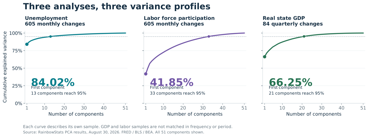
1. Unemployment: a strong common pattern, with a revealing exception
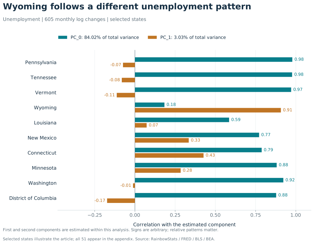
The unemployment result is striking. One component accounts for 84.02% of the total standardized variation in state unemployment log changes. All 51 state-level series, including D.C., load in the same direction on that component. A broad common unemployment-cycle or common-shock interpretation is therefore plausible.
Pennsylvania, Tennessee, and Vermont correlate approximately 0.98, 0.98, and 0.97 with that first component. These are correlations with the estimated component, not with the published national unemployment rate.
Wyoming is the clearest exception: its correlation with PC_0 is only 0.18. Louisiana is also less closely aligned, at 0.59, followed by New Mexico at 0.77. Here, an “outlier” means a state whose changes differ from the dominant pattern—not a state with necessarily high unemployment, poor policy, or weak economic performance.
The second component makes Wyoming especially interesting. PC_1 accounts for just 3.03% of total variation across the standardized state series, yet Wyoming correlates 0.91 with it. Connecticut and New Mexico also have positive associations, though much smaller ones.
A component that looks small in the overall system can matter greatly to an individual state. Wyoming is not simply statistical noise left over after the first component. Much of its movement is organized along another dimension.
Wyoming's small population gives us context, but population is not a direct measure of diversification. Industry employment shares or current-dollar GDP shares would test concentration more directly. The GDP analysis below supplies a useful additional clue without pretending to settle the explanation.
2. Labor participation: being in the labor market is a different question
Unemployment describes people in the labor force who do not have a job. Labor force participation describes how much of the relevant civilian population is working or looking for work. A person leaving the labor force changes the participation story even if that person is no longer counted as unemployed. BLS definitions and FRED participation notes.
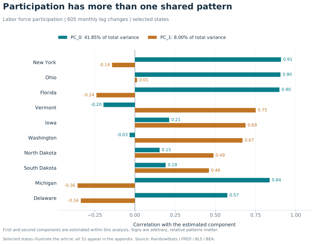
In this analysis, the first participation component accounts for 41.85% of variation. It is meaningful, but it leaves considerably more variation outside the first pattern than the unemployment analysis does in its own monthly sample.
New York, Ohio, and Florida correlate about 0.91, 0.90, and 0.90 with participation PC_0. Washington, by contrast, is essentially uncorrelated at −0.03. Vermont's association is modestly negative at −0.20, while North Dakota's is weakly positive at 0.15. Washington's small negative number should not be turned into a story about systematic opposition to the rest of the country.
Now look at the second component, which adds 8.00 percentage points to explained variance. Vermont, Iowa, and Washington correlate 0.75, 0.69, and 0.67 with PC_1. North and South Dakota also align positively. Michigan and Delaware lie on its other side.
This is the important inference: states that barely follow the first participation pattern can follow a second shared pattern quite strongly. Participation is not merely unemployment viewed through another label.
Different movements into and out of the labor force, demographic composition, migration, industry mix, and measurement effects are candidates for investigation. The PCA does not tell us which explanation is responsible. Because we analyze changes, it also does not directly explain why one state's participation rate is persistently higher than another's.
3. State GDP: common output growth and a resource-cycle clue
The third analysis uses real, rather than nominal, state GDP. The RQGSP series are quarterly. Their “seasonally adjusted annual rate” label describes the reporting units, not an annual observation frequency. FRED: Wyoming quarterly real GDP.
Within these 84 quarterly changes, the first component explains 66.25% of standardized variation. Ohio, Alabama, and New Jersey have the largest first-component loadings, with correlations around 0.95, 0.94, and 0.94. A shared output-growth or common-shock interpretation is a reasonable starting point.
Alaska, Delaware, North Dakota, and Wyoming are less closely aligned: their correlations with GDP PC_0 are approximately 0.34, 0.39, 0.40, and 0.43.
The second GDP component adds 5.12 percentage points of explained variance. Its largest positive loadings belong to Wyoming, Alaska, Oklahoma, New Mexico, North Dakota, and West Virginia. Their correlations with that component range from about 0.39 to 0.73.
That grouping gives the component a plausible resource- and commodity-cycle interpretation. External evidence makes the hypothesis worth taking seriously: BEA identified mining, quarrying, and oil and gas extraction as the leading contributor to GDP growth in North Dakota, New Mexico, and Wyoming in the second quarter of 2025. That is supporting context, not a validation of the component over the full sample. BEA release.
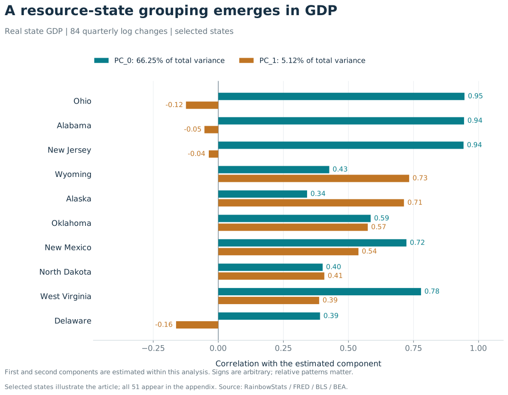
Delaware is a useful reminder not to overgeneralize. It also has a weak association with the first GDP component, but it does not join the positive resource-state grouping on the second. There can be more than one reason to depart from a common pattern.
The difference is in the meaning, not just the percentage
The first component is always the largest statistical pattern. It is not always the same economic phenomenon.
| Analysis | Plausible reading of the first pattern | What the second pattern adds |
|---|---|---|
| Unemployment | Broad common movements in joblessness | A particularly strong Wyoming dimension |
| Participation | Shared movements into and out of the labor force relative to population | A different grouping led by Vermont, Iowa, and Washington |
| Real GDP | Broad common movements in output growth | A grouping consistent with resource- and commodity-related exposure |
These are interpretations to investigate, not identified structural shocks. PC_1 in the GDP analysis is not the same variable as PC_1 in the unemployment analysis.
Wyoming illustrates the value of looking through several lenses. It departs from the dominant unemployment pattern and also appears prominently in GDP's second component. Washington and Vermont tell another story: their unemployment changes align closely with the first unemployment component, while their participation changes align much more with the second participation component. Neither observation would be apparent from one national headline.
Why this is a useful RainbowStats demonstration
The power is not that software supplies an economic explanation automatically. It is that the distance between asking a question and inspecting the evidence becomes very short.
A wildcard collects the states. LOGDIFF changes the question from levels to movements. PC_ANALYSIS finds the shared dimensions. SLIDESHOW presents summaries, explained variance, correlations, and loadings. We can then inspect the unusual states and ask a better next question.
That makes the script more than a convenient shortcut. It is a repeatable research design. Change the series pattern, retain the workflow, and investigate a new part of the state economy. Each run can be examined, challenged, and reproduced.
Fifty states do not require fifty separate research projects. Sometimes a few lines of script are enough to reveal where the common story ends—and where the interesting state stories begin.
Complete replication script
The nine lines below collect the three datasets, display their levels, and present each PCA. Paste the complete script into RainbowStats.
lUNRate=loop_State2($$UR)
set_title(line_Chart(lUNRate),"Unemployment Rates")
slideshow(pc_analysis(logdiff(lUNRate)))
LaborPart=loop_State_ANSICODE(LBSSA$$)
set_title(line_Chart(LaborPart),"Labor Participation")
slideshow(pc_analysis(logdiff(LaborPart)))
lGDP=loop_State2($$RQGSP)
set_title(line_Chart(lGDP),"Gross State Product")
slideshow(pc_analysis(logdiff(lGDP)))
Reproduce this analysis: Open the complete script and results in RainbowStats.
Notes for interpreting the results
- Scope: The analysis run on August 30, 2026 returned 51 series in each list, with 605 observations after log differencing for each monthly labor analysis and 84 for quarterly GDP. Each analysis uses its available common history; no common-frequency, common-period comparison across all three was performed.
- Meaning: Explained variance is in-sample statistical compression, not a forecast score or the fraction caused by a particular economic force. Low first-component correlation is descriptive, not a formal outlier test. GDP has only 84 observations for 51 variables, so the detailed higher components deserve particular caution.
- Signs and weights: The sign of a component can be reversed without changing the result. Relative signs and magnitudes are informative. Standardization gives each input series unit variance; this is not a population- or GDP-weighted national aggregate.
- COVID and data construction: The full samples include the pandemic. No pre-COVID or pandemic-exclusion robustness test was performed for this article. BLS state estimates are modeled, benchmarked to broader totals, and smoothed; some apparent commonality can reflect statistical construction as well as economic forces. BLS technical note.
- Chart construction: The article's portable SVG and PNG figures are redrawn from the returned RainbowStats results. State/component correlations are calculated from the reported eigenvector loadings and eigenvalues, retaining small values that the interactive correlation chart suppresses below its display threshold. The underlying results and calculation details are included in the package.
View the full 51-state appendix · Download the plain-text script